Chapter 5 Results
This section presents the empirical findings, beginning with an analysis of the components of structural ridability. It then assesses the environmental perception and network centrality. Finally, these dimensions are synthesized into a Cycling Environment Composite Index (CECI) to provide a holistic evaluation of London’s cycling environment at multiple scales.
5.1 Module 1: Structural Ridability
The analysis of structural ridability reveals a two-layer constraint system governing cycling quality: the institutional status of a facility, captured by a base index, and its operational effectiveness, determined by secondary factors.
5.1.1 Facility Type, Geometry, and Traffic Context
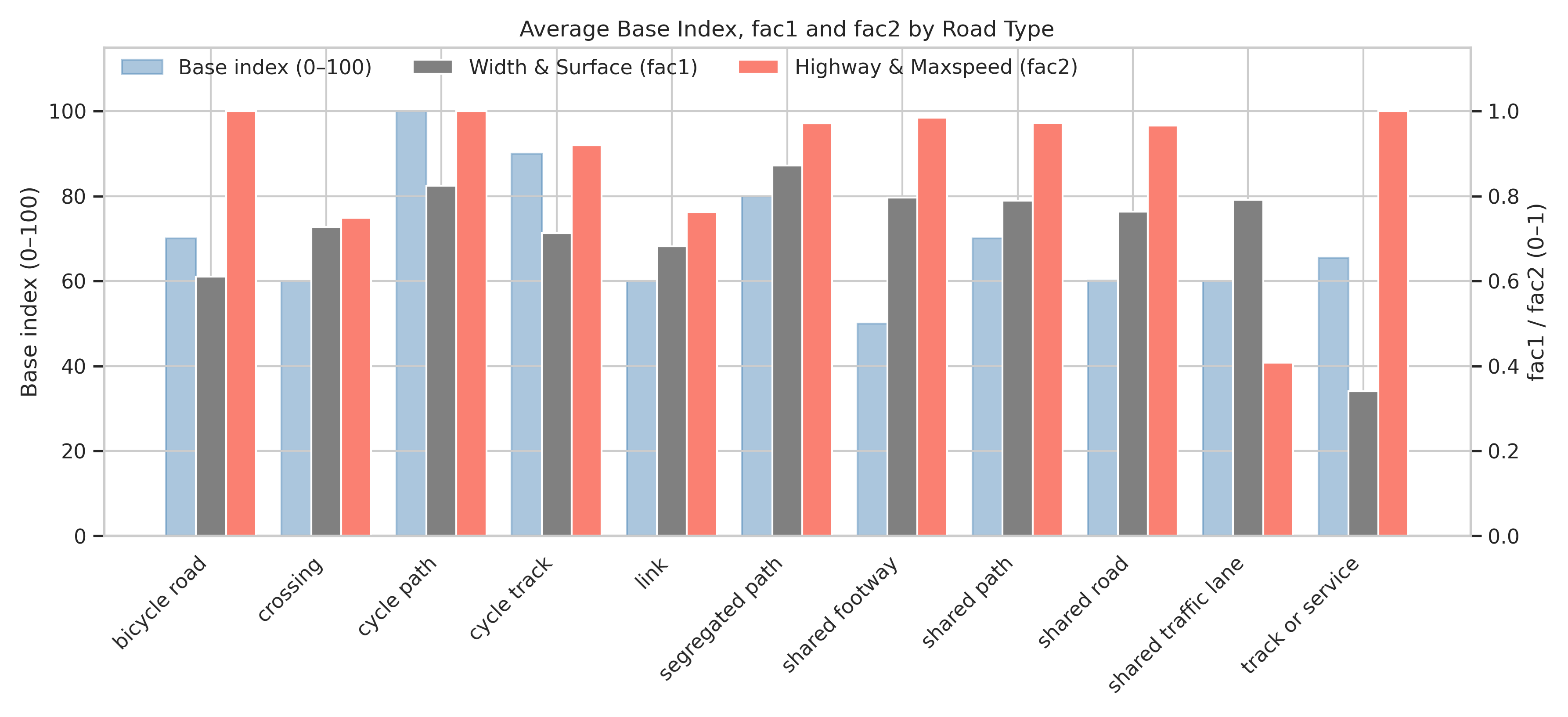
Figure 5.1: Average Base Index, fac\(_1\) and fac\(_2\) by Road Type
The base index primarily reflects a facility’s priority status. As shown in Figure 5.1, dedicated infrastructure such as cycle paths (base index =100) and cycle tracks (=90) receive high baseline scores. In contrast, mixed-traffic or pedestrian-shared facilities, including shared footways (=50) and shared traffic lanes (=60), score substantially lower. This “type prior” rewards physical separation from motor traffic. This base score is then modified by two correction factors: fac\(_1\) (width and surface) and fac\(_2\) (road class and speed).
Dedicated Facilities (Cycle Path/Segregated Path): These facilities exhibit high scores for both fac\(_1\) (=0.78-0.88) and fac\(_2\) (=1.0), indicating adequate width, good surfacing, and minimal adjacency to motor traffic.
Cycle Tracks: While fac\(_2\) remains high (=0.9+), a slightly lower fac\(_1\) (=0.70-0.75) suggests that localized geometric shortfalls, such as at bridge approaches or pinch points, can erode the advantage of a high base score.
Shared Roads: For shared roads, a low base score (=60) creates a “type ceiling,” capping the total index even with decent geometry (fac\(_1\) = 0.76-0.80) and speed conditions (fac\(_2\) = 0.95).
Shared Traffic Lanes: This category is constrained by a traffic bottleneck, evidenced by the lowest fac\(_2\) score (=0.4) across all types. This indicates that mixing with motor traffic is the primary inhibitor of quality, regardless of geometry.
Track or Service Roads: These routes are constrained by geometry and surface quality, exhibiting the lowest fac\(_1\) score (=0.34) despite having a fac\(_2\) of approximately 1.0 due to low-speed environments.
5.1.2 Topography and Traffic Stress
Beyond infrastructure, topography and traffic stress are key determinants of ridability.
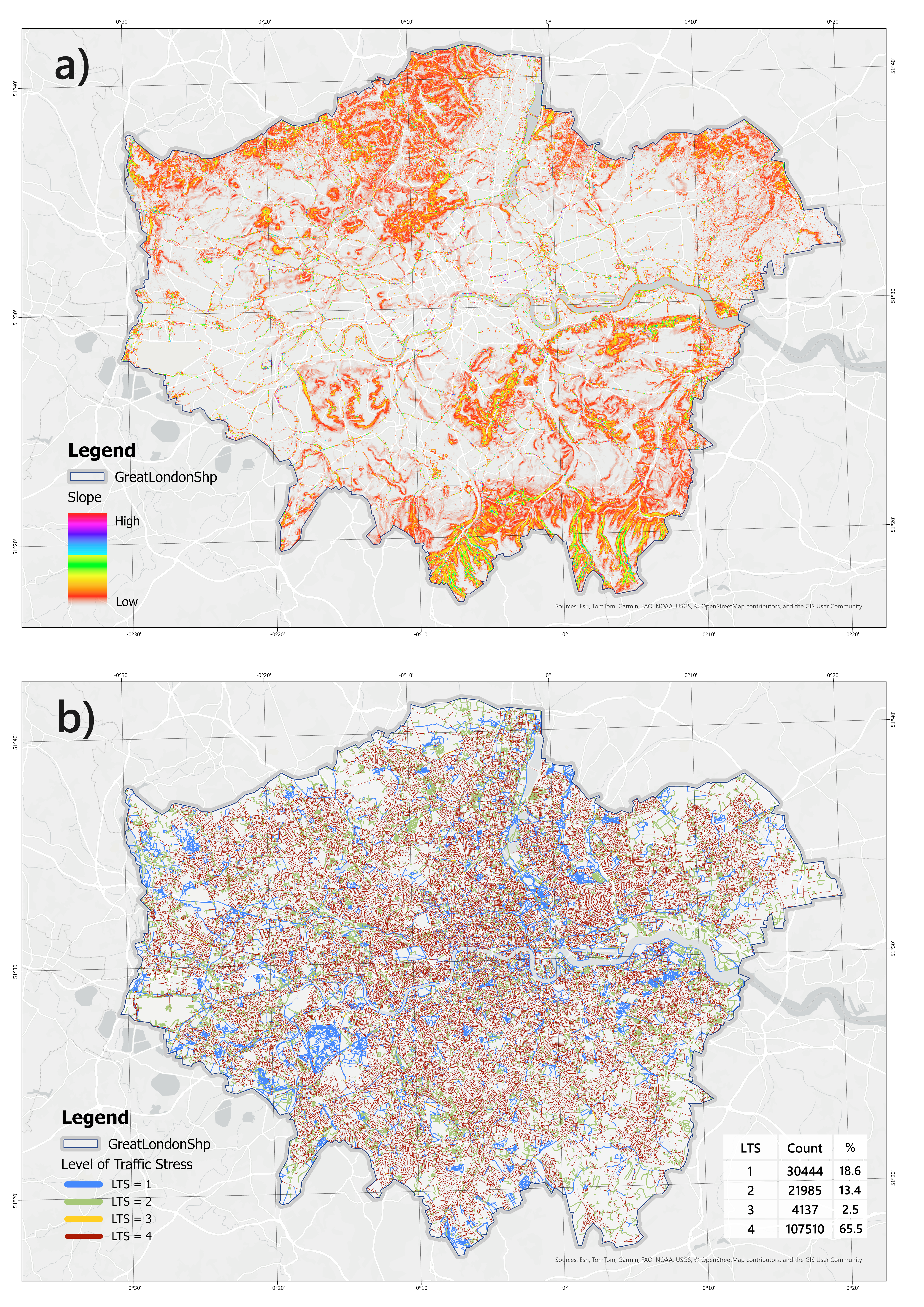
Figure 5.2: Spatial distribution of slope (a) and Level of Traffic Stress (b) across Greater London
- Slope (
fac_3)
The spatial distribution of slope across Greater London reveals a distinct topographic gradient, with high-slope areas predominantly concentrated along the northern and southern peripheries of the region (Figure 5.2). In particular, the southern belt exhibits continuous steep zones associated with the North Downs, while fragmented high-slope patches are observed in the northern uplands. By contrast, the central and eastern parts of London are characterized by extensive low-slope terrain, reflecting the dominance of the Thames floodplain and surrounding flatlands.
- LTS (
fac_5)
At the citywide scale, high-stress segments dominate the network. By link counts, LTS = 4 comprises 65.5% (107,510 links) and LTS = 3 2.5% (4,137 links), whereas low-stress LTS = 1 and LTS = 2 account for 18.6% (30,444 links) and 13.4% (21,985 links), respectively. This distribution indicates that, in its current form, London’s cycling network primarily serves riders with greater experience or higher stress tolerance. Although low-stress facilities are widespread, they are largely fragmented and corridor-based, rather than forming a continuous citywide backbone.
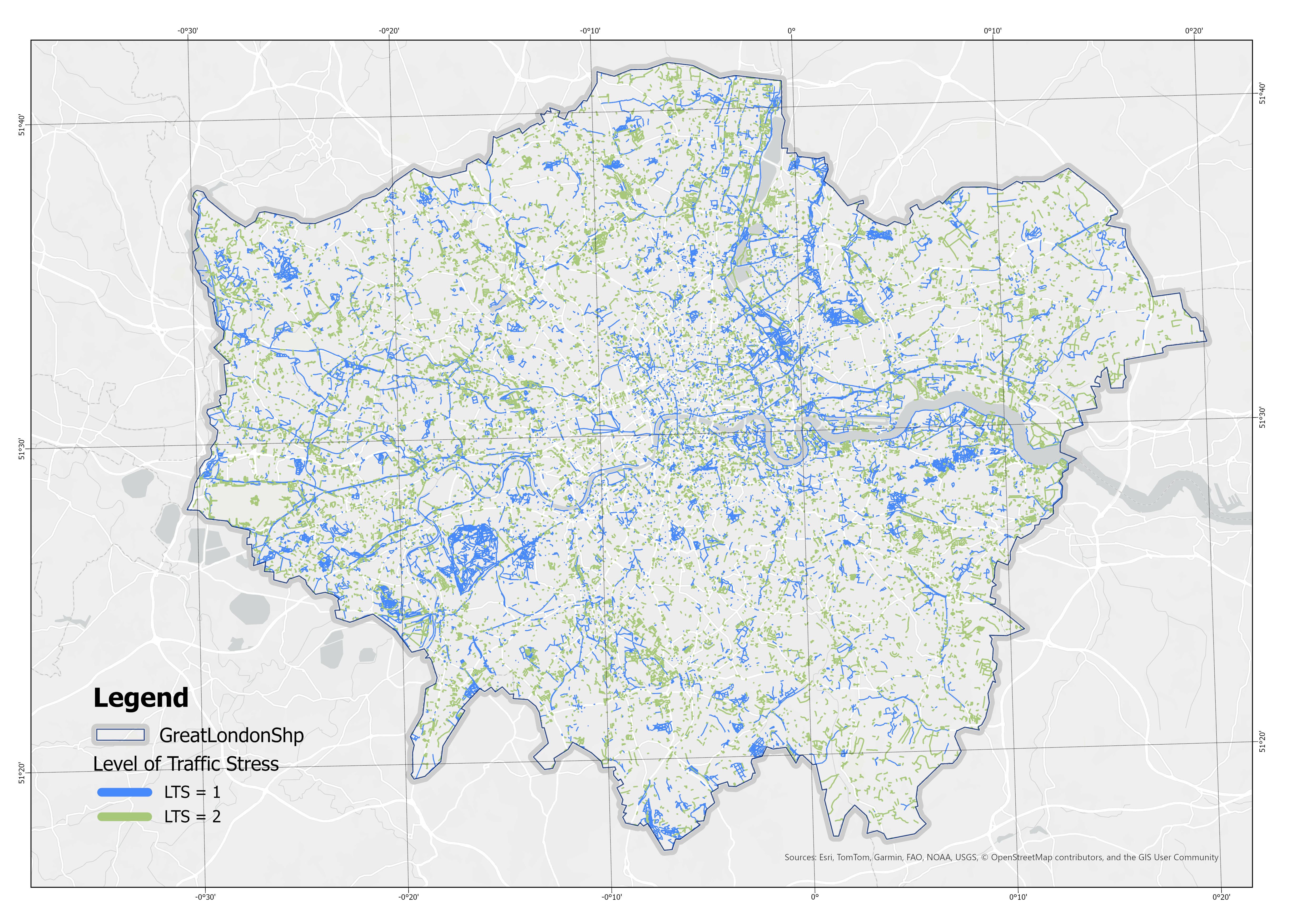
Figure 5.3: Distribution of Low-Stress Routes (LTS 1 and 2) in London
Spatially, LTS = 1 “blue corridors” concentrate along motor-traffic-free or strongly separated alignments, including rivers/canals, greenways traversing large parks, and a subset of newly built or retrofitted segregated cycle tracks. These corridors are internally continuous, yet connections between corridors and into the metropolitan core are frequently severed by LTS = 3–4 segments. LTS = 2 is more common on lower-speed, lower-class residential streets, forming patches in the outer boroughs; however, inter-patch continuity is still constrained by LTS = 4 radial arterials and ring roads. LTS = 3–4 are widespread along primary/fast corridors, bridgeheads, and key connectors—locations that typically combine higher motor-traffic speeds and volumes or mixing with bus lanes—thus functioning as critical bottlenecks to network continuity.
These patterns are consistent with the classification logic: the script applies thresholding on way type, effective width, and speed limit, while also detecting sidepaths relative to adjacent motor carriageways. Facilities with physical separation or explicit cycle priority (cycle tracks/segregated/shared paths that satisfy width/speed criteria) are assigned to LTS = 1–2. Segments that mix with motor traffic, fall below width thresholds, or exceed 30 km/h speed limits are escalated to LTS = 3–4. In addition, shared/segregated paths that are not sidepaths are down-weighted for motor adjacency, biasing them toward lower LTS and producing the observed low-stress “blue network” along greenways, parks, and waterfronts. Where these routes must cross primary roads or bridges, the speed/width thresholds are triggered and stress increases sharply, yielding the red breakpoints observed in the map.
5.1.3 Miscellaneous attributes (Fac_4)
Regression analysis shows that fac_4 contributes negligibly to the variation of index_1_nor (R² = 0.003). Although the coefficient is statistically significant ( \(\beta = 26.91\), \(p < 0.001\) ), the explained variance remains below 1%, confirming that fac_4 functions primarily as a correction factor rather than a substantive determinant of the index. Given its marginal explanatory power, fac_4 was not visualised separately in the results section but was instead acknowledged as an auxiliary adjustment within the index construction.
5.1.4 Index of structural ridability
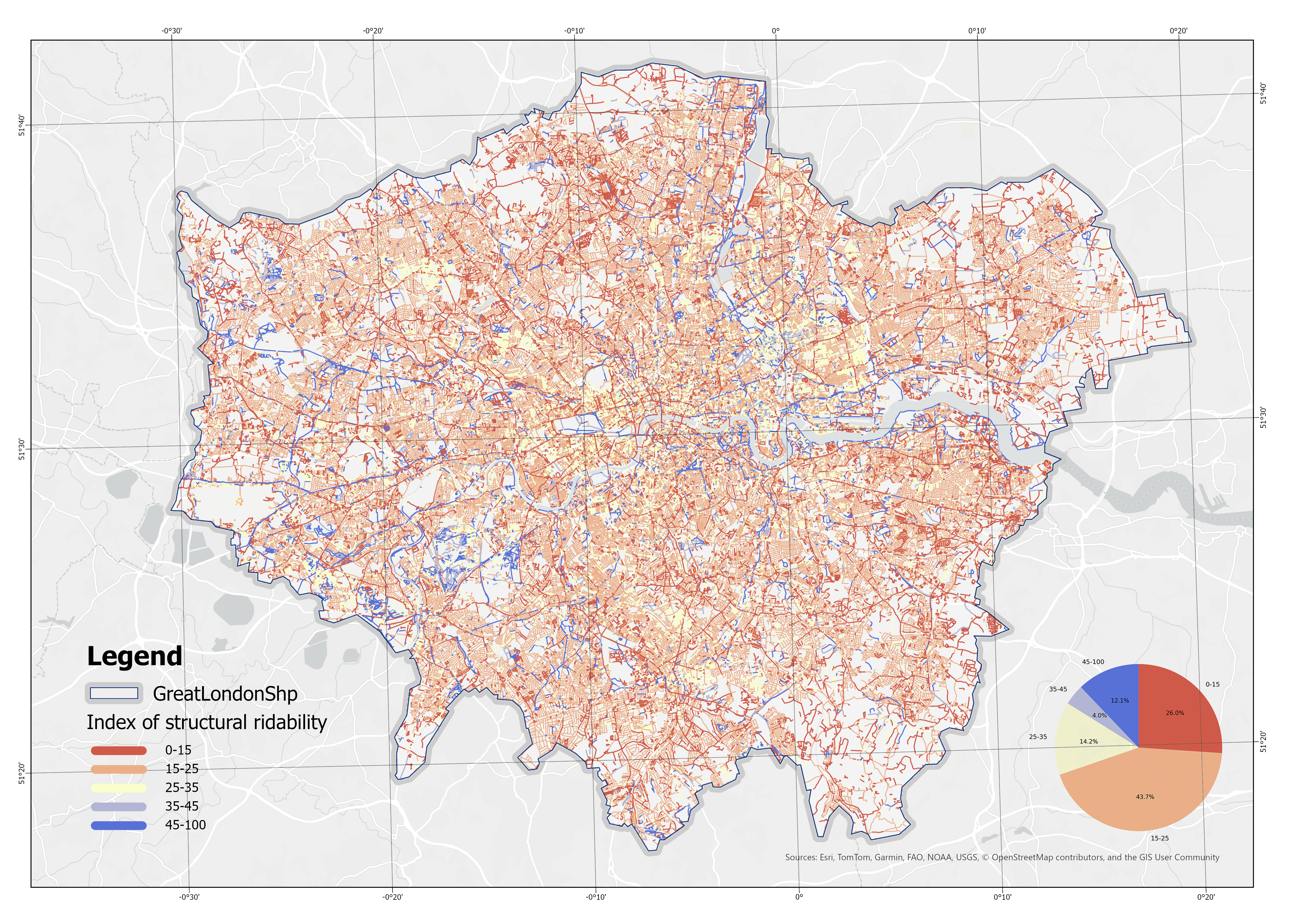
Figure 5.4: Spatial Distribution of the Index of Structural Ridability (Higher values indicate better performance)
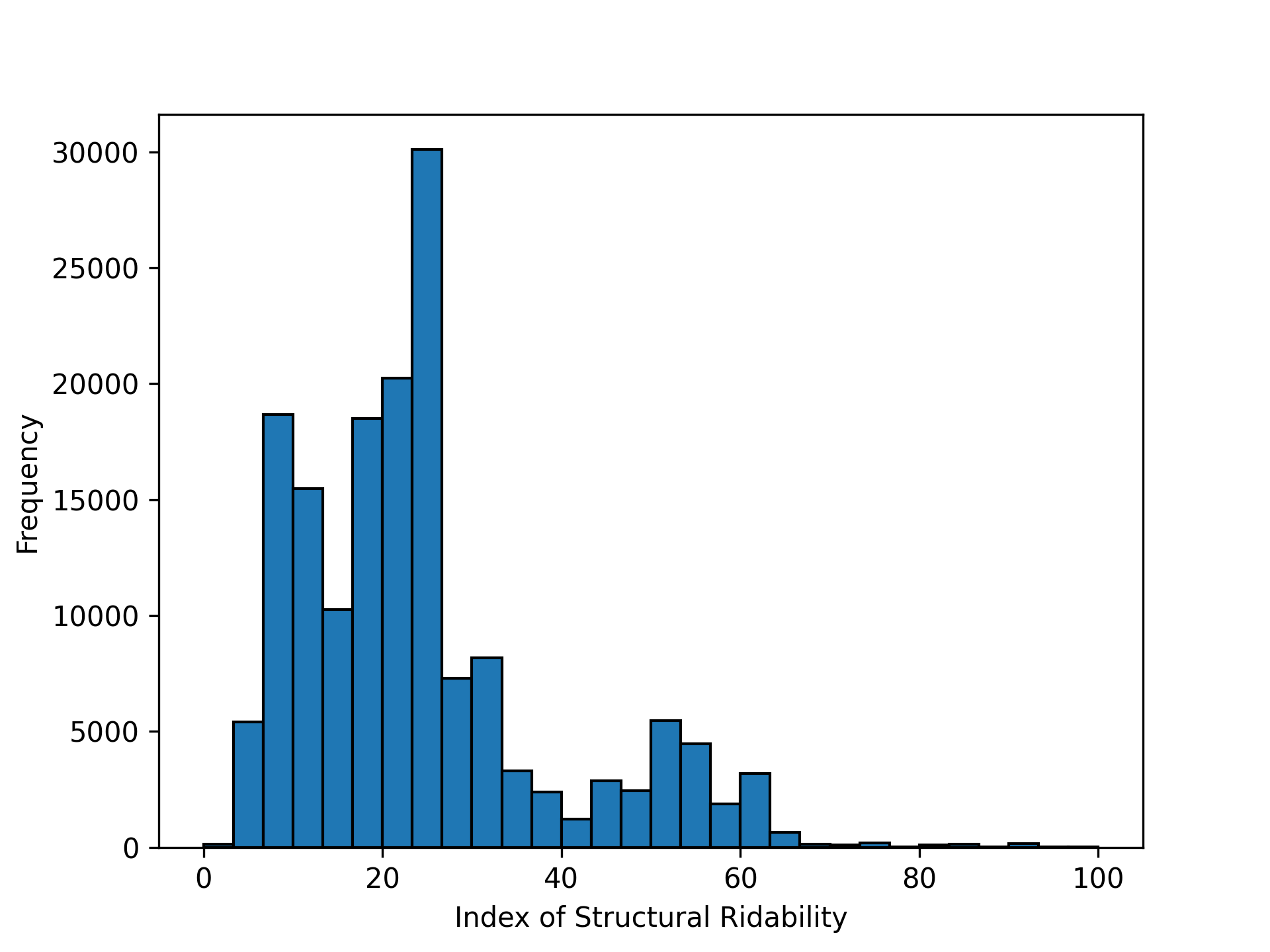
Figure 5.5: Histogram of Index of Structural Ridability
The spatial distribution of the structural ridability index reveals a predominantly mid-range performance across London. As shown in the map with a pie chart 5.4 and the histogram 5.5, nearly 70% of road segments fall within the 15–25 and 25–35 bands, indicating that the majority of the cycling network provides only moderate levels of rideability. In contrast, low-value segments (0–15) remain limited, though not negligible, and are dispersed across multiple boroughs. High-value corridors (>45) are comparatively rare but spatially clustered along specific arterial routes, suggesting that well-performing links tend to form isolated pockets rather than a continuous backbone. Overall, the results highlight a broad concentration around medium scores, with only a small proportion of routes delivering consistently safe and comfortable conditions.
5.2 Module 2: Environmental Perception
This module broadens the analysis to the perceptual and environmental context of cycling. A composite index was developed from three variables: Green View Index (GVI), NO\(_2\) concentration, and natural landscape coverage.
5.2.1 Green View Index (GVI)
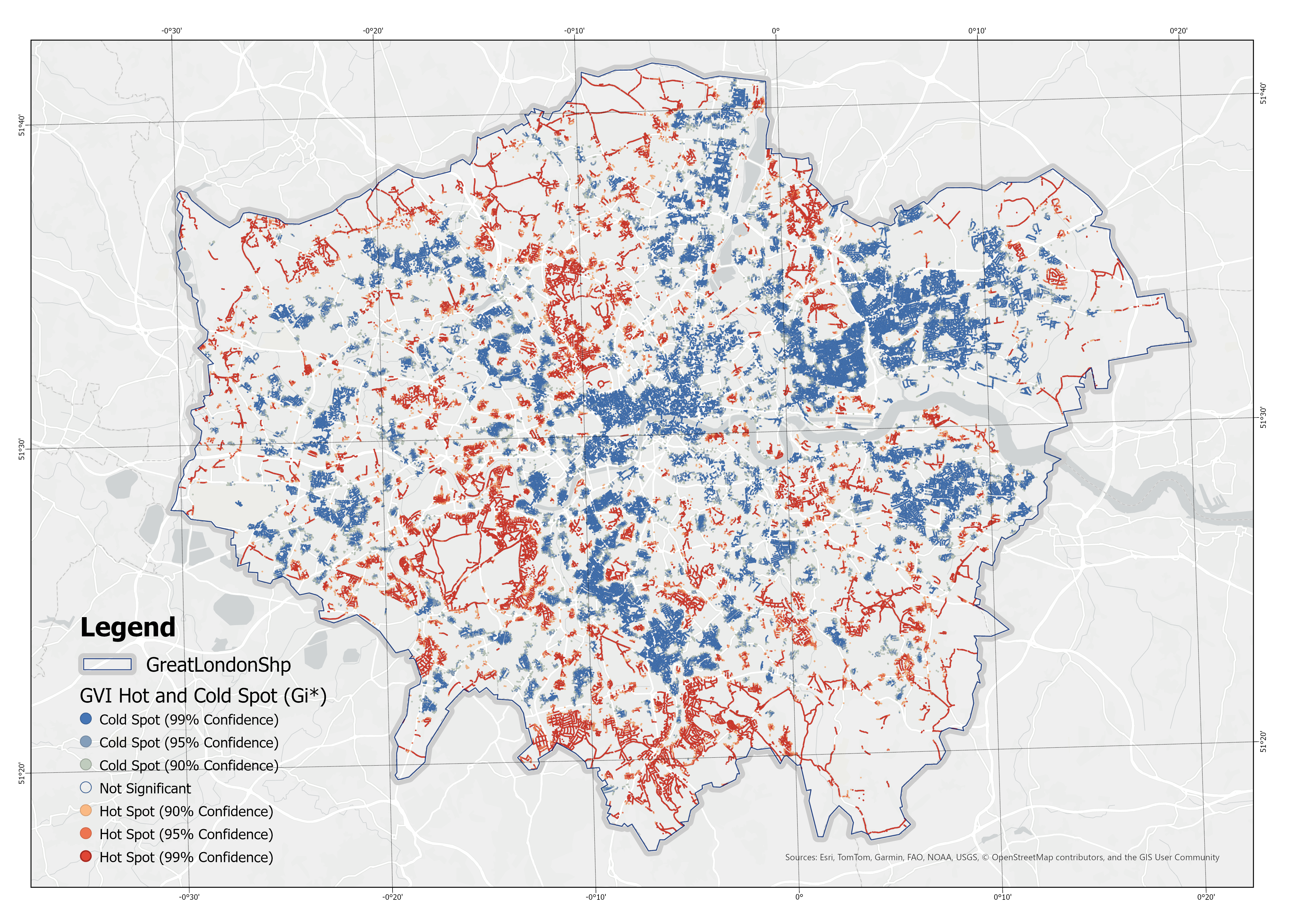
Figure 5.6: Hot and Cold Spot Analysis (Getis-Ord Gi*) of the Green View Index (GVI)
This is a GVI heat map, which shows that the distribution of people’s perception of green landscapes is not random but exhibits a distinct clustering pattern. High-value clusters (hot spots) are predominantly located in areas with large urban parks, river corridors, and low-density residential neighborhoods, forming continuous belts of greenery. In contrast, low-value clusters (cold spots) are concentrated in the urban core, particularly around transport interchanges, high-density commercial centers, and major road intersections where vegetation is limited.
5.2.2 NO\(_2\) Concentration
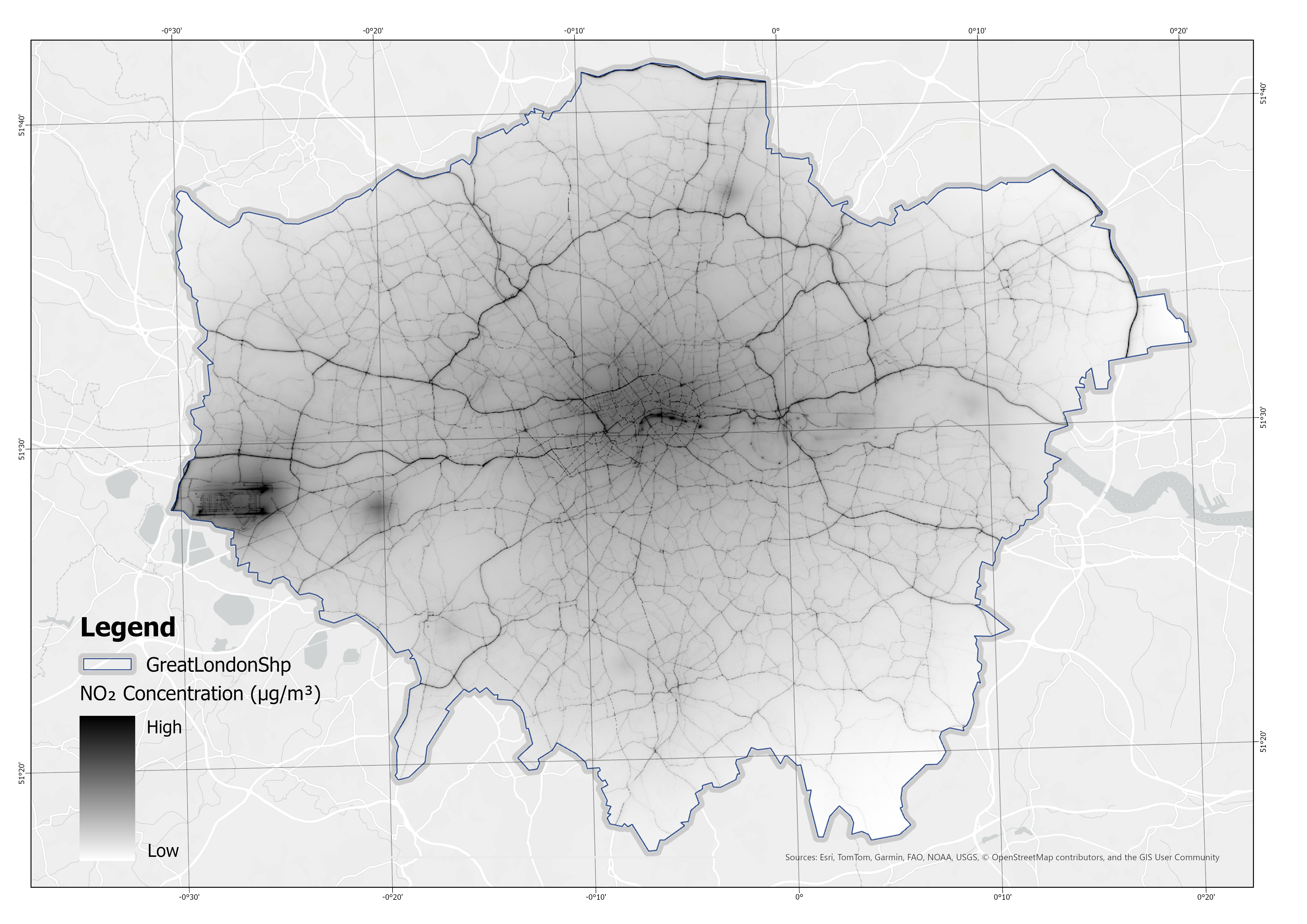
Figure 5.7: Spatial Distribution of Annual Mean NO\(_2\) Concentration.
The spatial distribution of NO\(_2\) concentration mirrors the urban transport system. Elevated values are observed along major arterial roads, highways, and around transport hubs, forming a clear “corridor effect.” These areas, typically characterized by heavy traffic flow, exhibit persistent air quality challenges. By contrast, peripheral zones and green buffer areas display significantly lower concentrations, reflecting the mitigating effect of distance from vehicular emissions. The overall pattern highlights the dominant role of transportation emissions in shaping urban air pollution gradients, reinforcing the spatial inequality in environmental exposure across the study area (Figure 5.7).
5.2.3 Natural Landscape
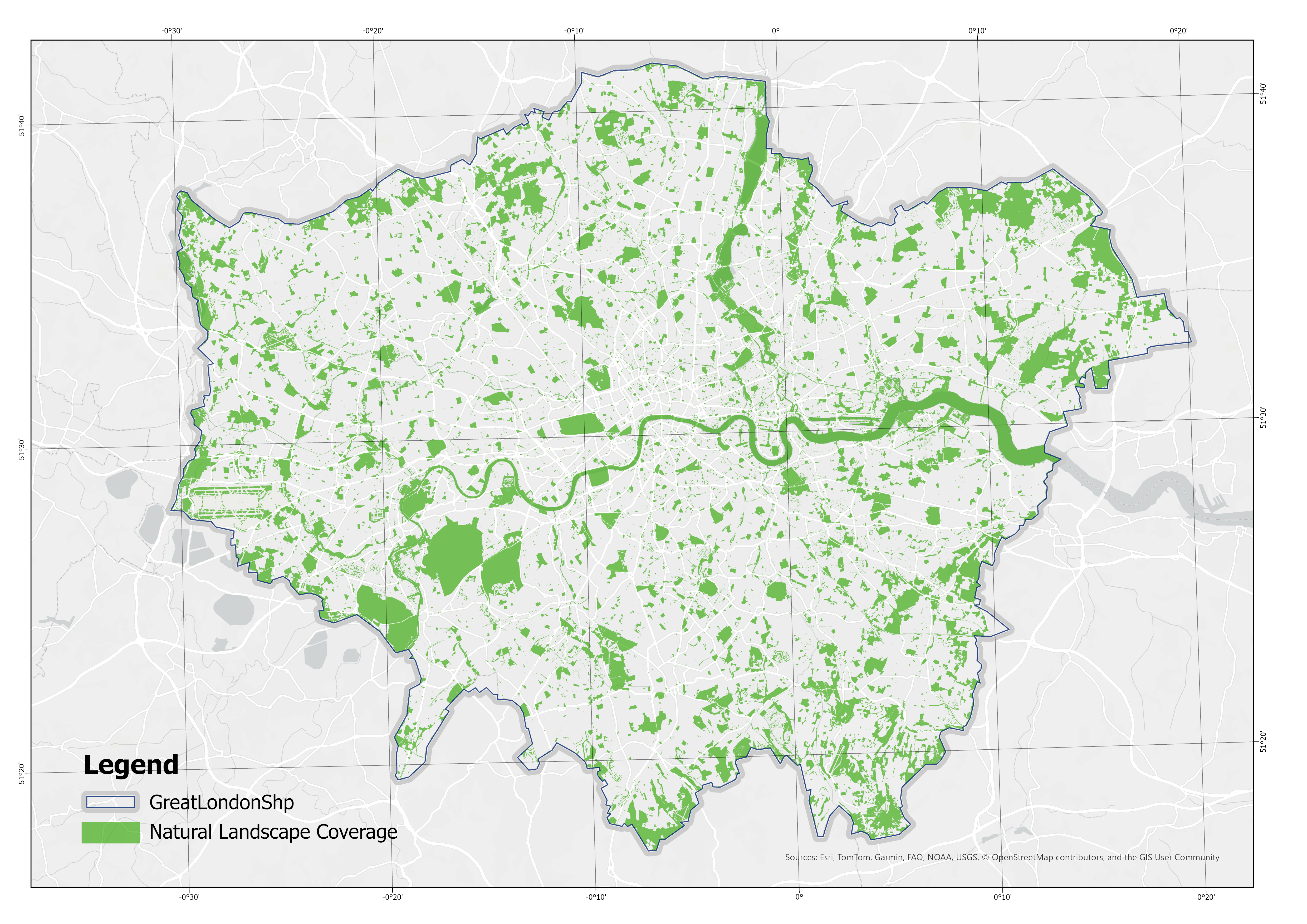
Figure 5.8: Spatial Distribution of Natural Landscape Coverage.
The spatial distribution of natural landscape features presents a dispersed yet relatively balanced pattern. High-value clusters are concentrated along riverbanks, lakes, and peri-urban zones, forming ecological patches with visible continuity. In the urban core, the index values decline sharply, with natural landscape elements confined to isolated historical parks or large-scale public open spaces. This spatial pattern underscores the dominance of built-up land use in central districts while highlighting the ecological advantages of peripheral zones. The results suggest that natural landscapes in cities act as fragmented ecological enclaves that provide important, though unevenly distributed, ecosystem services (Figure 5.8).
5.2.4 Index of environmental perception
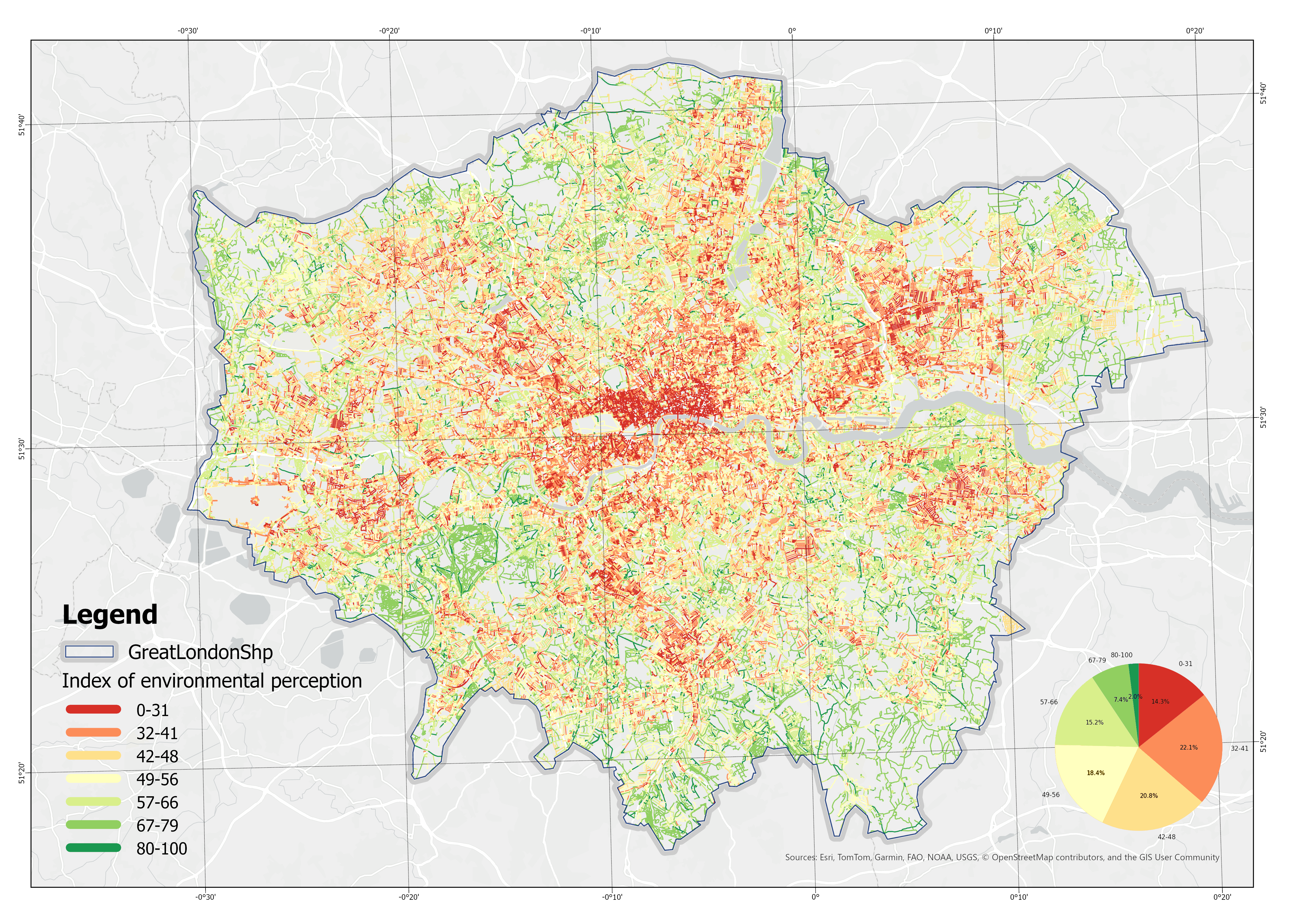
Figure 5.9: Spatial Distribution of the Index of Environmental Perception (Higher values indicate better performance)
When constructing the composite index that integrates GVI, NO\(_2\), and natural landscape variables, a weighting adjustment was applied to account for the partial overlap between fac\(_1\) (GVI) and fac\(_3\) (natural landscape), both of which represent greenery-related attributes. Specifically, the weight of fac\(_3\) was slightly reduced to avoid redundancy. To ensure the robustness of factor integration, a multicollinearity test was conducted using correlation matrices (Figure 5.9) and Variance Inflation Factor (VIF) statistics. The results confirmed that all variables have VIF values close to 1 (fac_gvi = 1.077, fac_NO\(_2\) = 1.039, fac_nat = 1.057), indicating the absence of multicollinearity and supporting the rationality of the weighting scheme.
The resulting composite index demonstrates a distinct spatial gradient. High-value areas are primarily distributed in peripheral districts characterized by abundant green infrastructure and natural landscape patches, whereas low-value areas are concentrated in the city center, where limited greenery coincides with elevated pollution levels. This contrast highlights the compounded disadvantage faced by central urban districts, where deficits in environmental quality are most pronounced (Figure 5.9).
In summary, the results from Module 2 reveal differentiated spatial patterns across three key dimensions of the urban environment—green visibility, air pollution, and natural landscape—and demonstrate the value of synthesizing them into a single composite indicator. The findings confirm that central urban areas consistently perform worse in terms of environmental livability, while peripheral districts benefit from greater ecological resources and lower pollution burdens. The multivariate analysis further validates that the integration of these factors is statistically robust and analytically meaningful. Collectively, this module provides a solid empirical foundation for evaluating urban environmental quality and supports the application of multi-factor composite indices in spatial planning and sustainability research.
5.3 Module 3: Network Centrality
5.3.1 Interpretation of Centrality Patterns in London’s Road Network
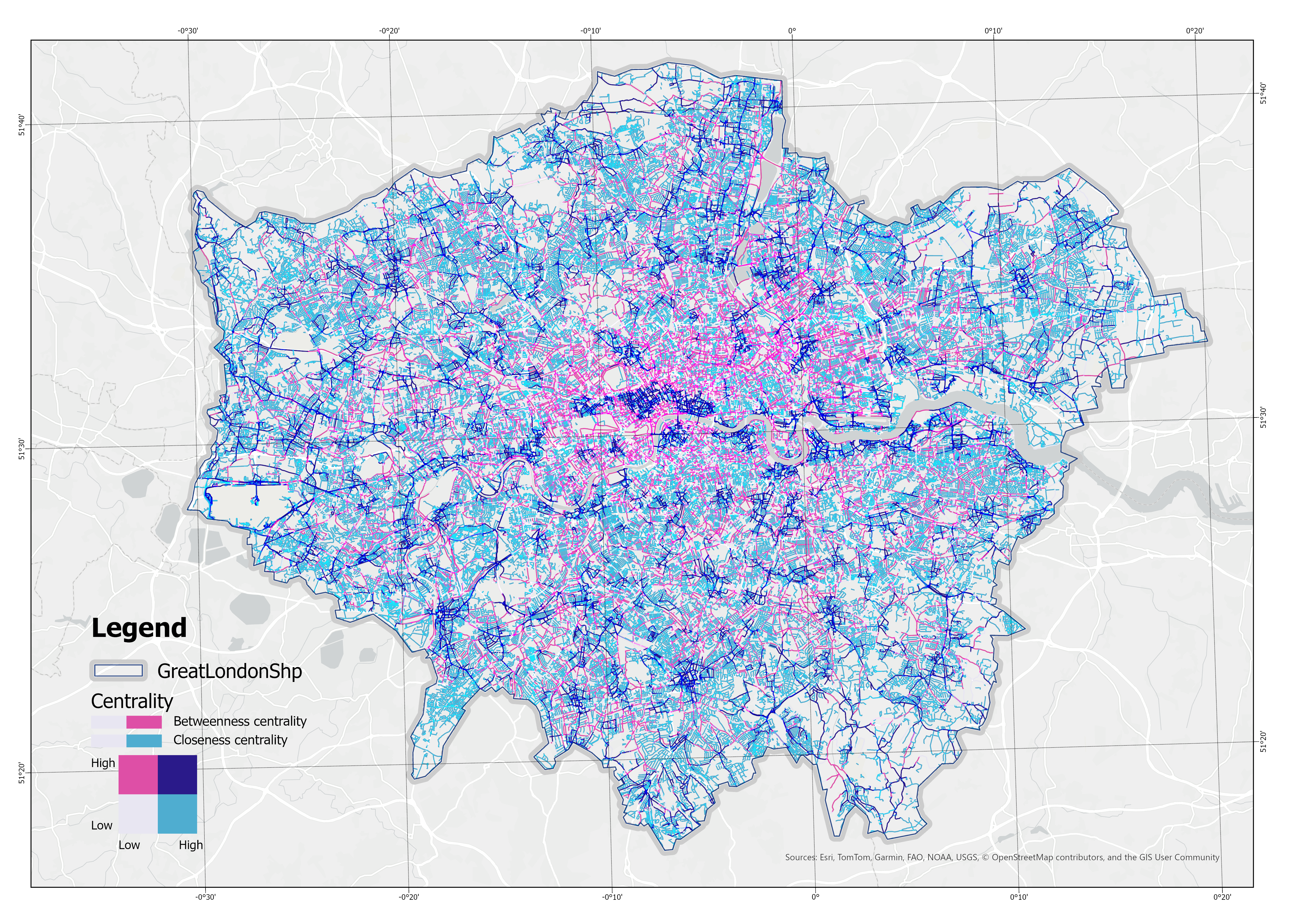
Figure 5.10: Betweenness and Closeness Centrality in London’s Road Network
The spatial distribution of betweenness and closeness centrality in London’s street network demonstrates a pattern that is consistent with the city’s established urban structure. High values of both indices are concentrated in the central districts, particularly within the City of London, the West End, and adjacent areas along the Thames. This reflects the dense street configuration and the high level of interconnectivity, whereby these locations serve both as destinations of significant accessibility (closeness) and as critical intermediaries on shortest paths (betweenness).
Beyond the central core, radial arterials and major corridors exhibit elevated betweenness but comparatively lower closeness values. These road segments function as structural backbones of the metropolitan network, accommodating through-traffic and inter-district connections, but offering less balanced accessibility relative to the urban center. In contrast, peripheral suburban areas are characterized by low values of both measures, indicating their marginal role in the overall network in terms of both through-movement and spatial reachability.
The results also highlight the role of river crossings. Bridges along the Thames demonstrate disproportionately high betweenness centrality, reflecting their status as bottlenecks in the network that channel a substantial share of shortest-path flows across the river. This spatial concentration is consistent with the network dependency on limited crossing points.
5.3.2 Index of network centrality
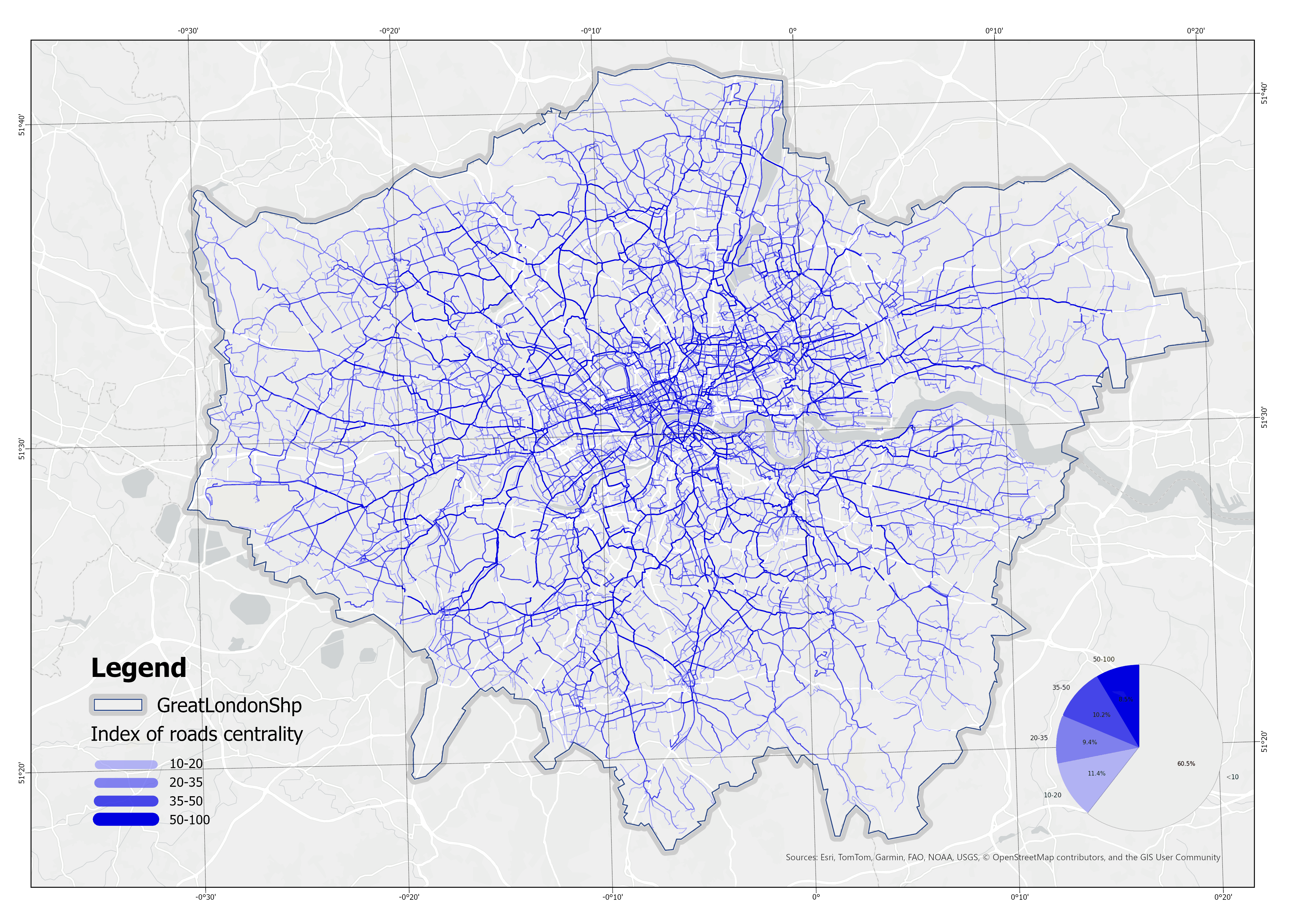
Figure 5.11: Spatial Distribution of the Index of Network Centrality (Higher values indicate better performance)
The composite centrality index demonstrates a highly uneven distribution across London’s road network. High-centrality roads are concentrated within the central districts and along radial corridors, reflecting the city’s monocentric structure combined with radial arterial organization. Peripheral suburban streets are predominantly located in the lowest centrality category, highlighting their marginal contribution to overall connectivity.
The proportional analysis further reveals that nearly 70% of the road segments fall into the lowest category (<20), while only a small fraction of arterial and core streets attain values above 50. This imbalance underscores the hierarchical nature of London’s road system, where a limited set of primary corridors sustains the majority of spatial accessibility and through-movement across the metropolitan area.
5.4 Cycling Environment Composite Index (CECI) Analysis
Synthesizing the structural, environmental, and network metrics, the final CECI provides a holistic assessment of London’s cycling environment.
5.4.1 City-Wide Distribution and Bottleneck Identification
Figure 5.12: Spatial Distribution of the Cycling Environment Composite Index (CECI) by Quantile (Higher values indicate better performance)
The figure 5.12 illustrates the Cycling Environment Compliance Index across Greater London, computed at the road-segment level and classified by quintiles. A pronounced core–periphery gradient is evident: low-value segments are densely concentrated in the inner city and central areas, while the outer boroughs gradually transition to medium and higher scores. Spatially, several continuous high-value corridors can be identified, most prominently along the Thames, canal routes, and selected upgraded arterials. However, these are frequently interrupted by low-value “breakpoints” at bridges, junctions, and complex intersections, reflecting the weakening of network continuity at critical nodes. In outer London, high-value links tend to appear as scattered patches, often connected to park greenways or local residential streets, but rarely forming coherent networks at a commuting scale.
Regionally, the most substantial cluster of low values is located within London’s Central Activity Zone (CAZ), covering the Oxford Street–Strand corridor and its surrounding districts, including Soho, Covent Garden, and Bloomsbury. Here, the extremely dense street network, frequent intersections, and heavy motor traffic volumes contribute to persistently low index scores (0–35% percentile), forming a continuous and extensive low-value core. This area not only constrains local cycling accessibility but also functions as a critical barrier, interrupting east–west and north–south connections between higher-quality corridors at the city-wide level.
In sum, London’s cycling environment demonstrates a pattern of linear clustering along major corridors, widespread low-quality coverage on side streets, and insufficient continuity across rivers and key nodes. High-quality facilities are largely confined to linear routes and have not yet permeated the dense urban fabric.
5.4.2 CECI Kernel Density Estimation in London
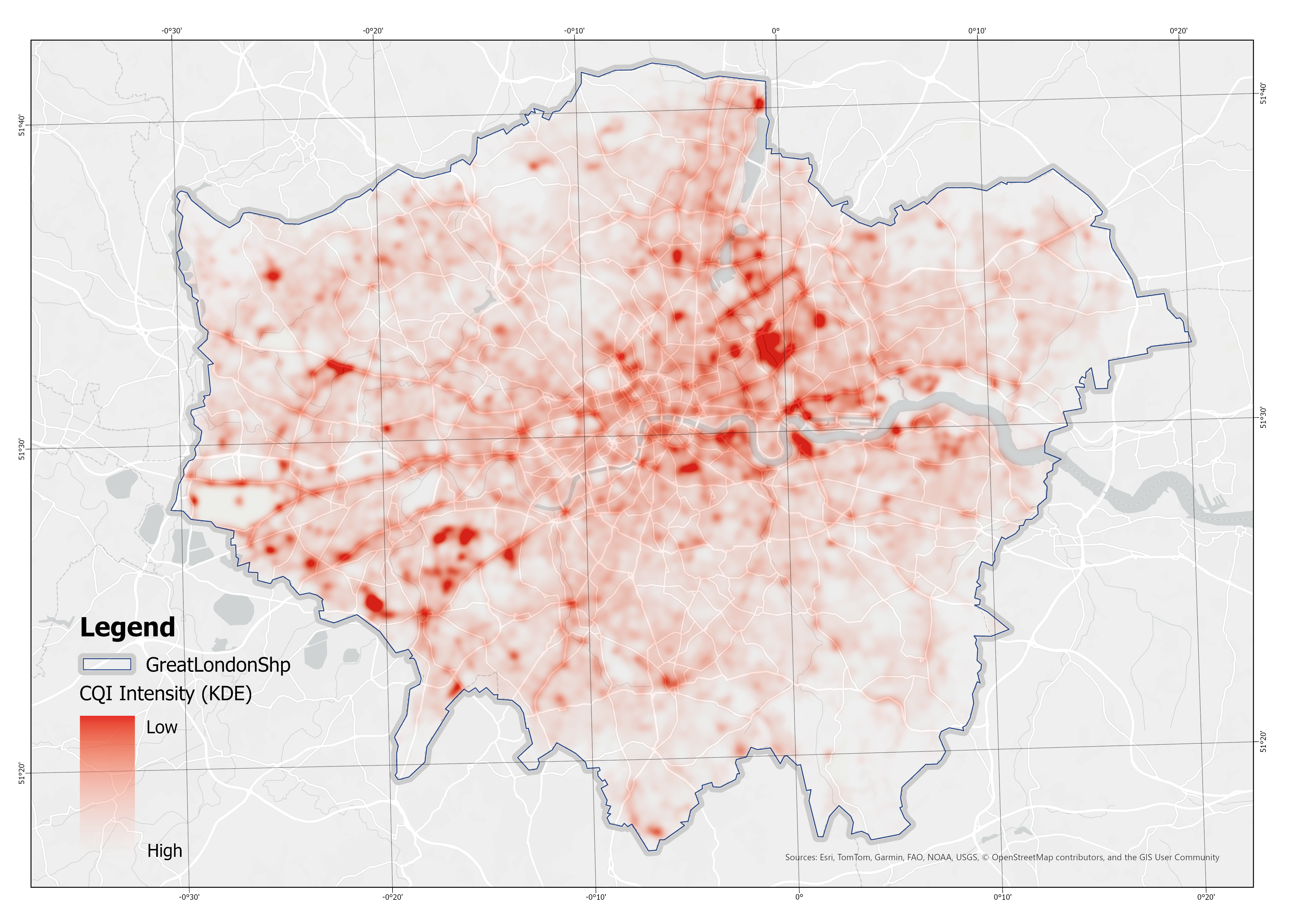
Figure 5.13: Kernel Density Estimation (KDE) of Low-CECI Road Segments
This study applied kernel density estimation (KDE) to identify the spatial distribution of the Cycling Environment Composite Index (CECI). Road segments were sampled at 10 m intervals, CECI values were winsorised at the 1st–99th percentiles and normalised, and weighted points were aggregated on a 10 m grid with a 200 m Gaussian kernel. A separate surface was also generated for the top 20% of CECI values to emphasise high-performing corridors.
The results show that clusters of low-CECI segments are predominantly concentrated in central and inner London, including the City and adjacent districts, where dense traffic flows and infrastructural pressure coincide with lower quality. Additional hotspots extend along several radial corridors, indicating stretches of consistently constrained accessibility and performance. In contrast, outer suburban areas exhibit weaker KDE intensity, reflecting fewer contiguous clusters of low-quality segments. These patterns highlight the uneven spatial distribution of deficiencies, with concentrations emerging in areas of high demand and structural significance.
- Stratford
A pronounced cluster of low CECI values is identified in the Stratford area of East London. This pattern is largely attributable to the hydrological configuration of the River Lea and its multiple distributaries, which fragment the street network and constrain lateral connectivity. As a result, movement is channelled through a limited set of arterial roads such as the A12 and Stratford High Street. While these main corridors demonstrate relatively higher quality, the surrounding secondary and local streets suffer from discontinuity and weak integration, which collectively depress the overall CECI in the area.
In contrast to the historic city centre—where a dense grid structure and abundant redundant links facilitate robust accessibility—Stratford’s network is more vulnerable to fragmentation. The juxtaposition of a few strong arterial connectors with a wider set of poorly integrated local streets creates a marked cluster of low CECI intensity, underscoring the structural deficiencies induced by riverine segmentation.
- Isle of Dogs
The Isle of Dogs and its adjacent areas, including Rotherhithe to the west, North Greenwich to the east, and the northern edge around Limehouse, exhibit persistently low CECI values. This spatial pattern reveals significant structural deficiencies in the cycling network. Unlike motorised traffic, cyclists cannot rely on river tunnels such as the Blackwall Tunnel or the Limehouse Link, which officially prohibit or effectively restrict non-motorised access. The newly opened Silvertown Tunnel follows the same pattern, disallowing bicycles and offering only a limited shuttle bus alternative. As a result, cross-river cycling connectivity in this section of the Thames is severely constrained, and cyclists are forced into lengthy detours that substantially reduce network centrality.
Within the Isle of Dogs itself, the street system is dominated by inward-facing residential developments and cul-de-sacs, which further fragment the cycling network. While certain primary corridors maintain relatively higher scores, the absence of continuous east–west and north–south links suppresses overall accessibility. In contrast, central London benefits from a denser grid and multiple bridge crossings, providing cyclists with abundant routing options and higher network resilience. The combination of riverine barriers, restricted tunnel access, and local street discontinuities collectively explains the conspicuously low CECI in the Isle of Dogs region, highlighting the systemic limitations in cycling infrastructure integration across East London.
- Major parks
Several other large clusters of low CECI values are found within London’s major parks. While such green spaces contribute positively to environmental perception, their functional characteristics inherently limit cycling network performance. In most cases, only a few primary corridors within or along the edges of the parks achieve relatively high CECI scores. However, the majority of internal routes provide limited infrastructure and weak network centrality, which substantially lowers the average quality within these areas. Given the extensive land coverage of these parks, these deficiencies aggregate into pronounced clusters in the KDE output.
5.4.3 The CECI analysis at the borough level
In order to conduct a more detailed analysis of the CECI in London, this study also carried out a graded analysis based on the borough as the scale.
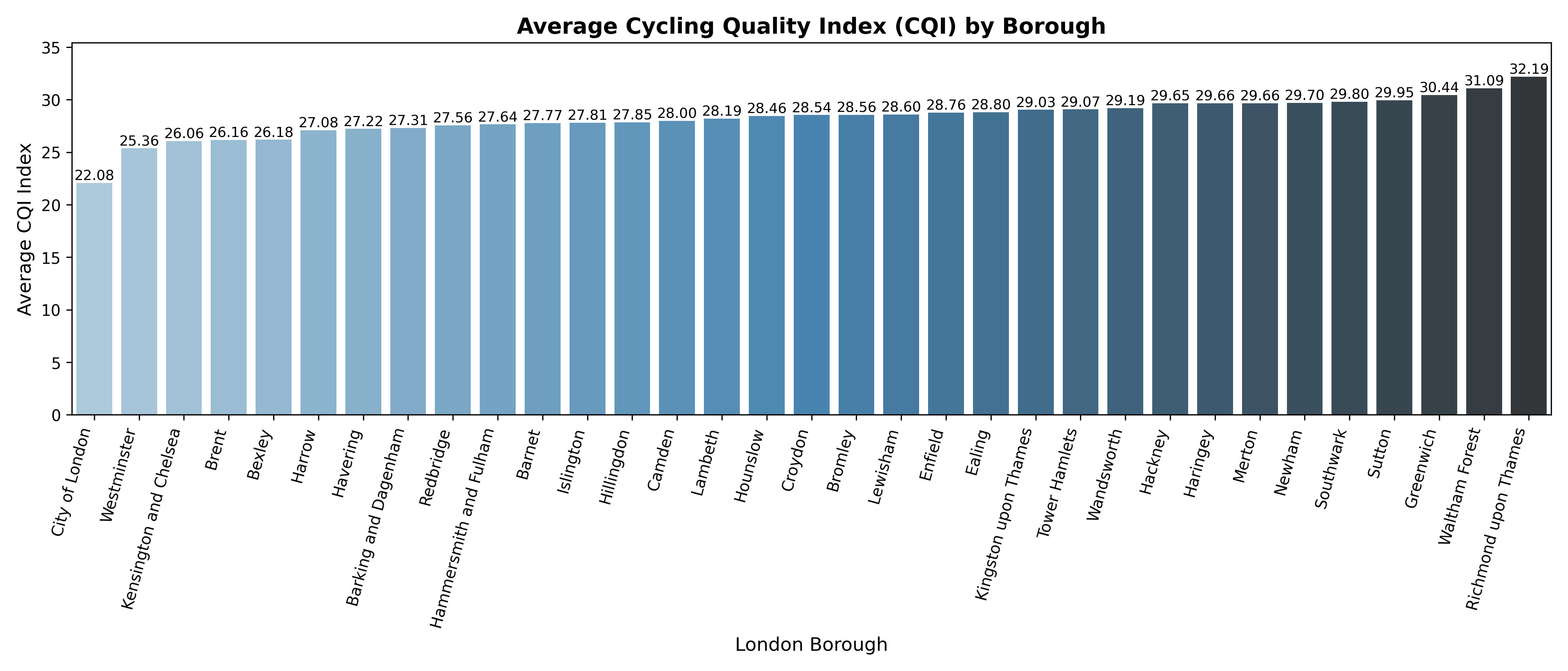
Figure 5.14: Average CECI by London Borough
By averaging the CECI across boroughs, notable spatial disparities emerge. The highest-performing areas are Richmond upon Thames (32.19), Waltham Forest (31.09), Greenwich (30.44), Sutton (29.95), and Southwark (29.80), which all exceed the citywide mean and highlight relatively stronger cycling environments. In contrast, the lowest CECI values are observed in City of London (22.08), Westminster (25.36), Kensington and Chelsea (26.06), Brent (26.16), and Bexley (26.18), reflecting more constrained cycling conditions. This divergence suggests that central and inner boroughs with dense urban form and heavy traffic flows tend to perform worse, while outer or suburban boroughs with more space and dedicated infrastructure achieve higher quality levels. The results point to a spatial imbalance in cycling provision, where infrastructure quality does not align evenly with urban density and travel demand.
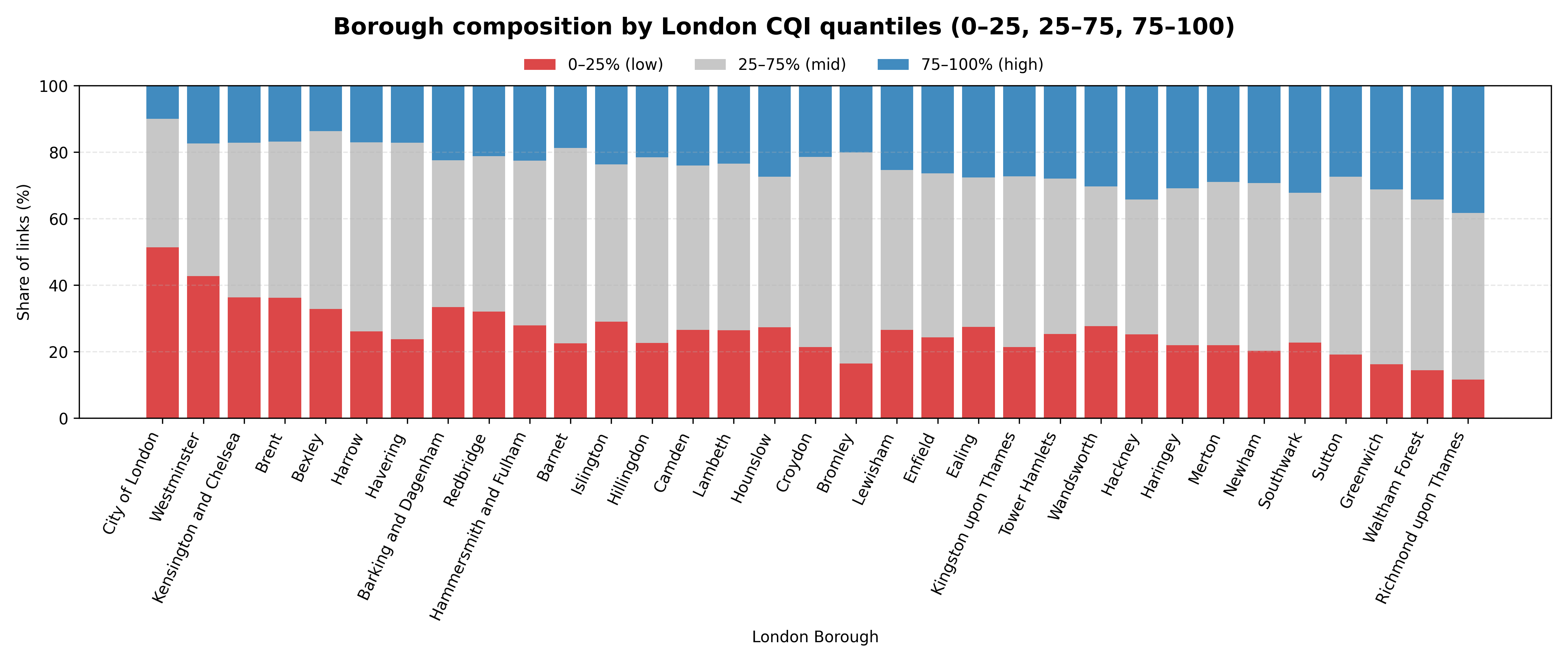
Figure 5.15: Borough Road Composition by London-Wide CECI Quantiles
By examining borough-level road composition according to London-wide CECI quantiles, clear differences can be observed. The City of London shows the highest proportion of low-CECI links, highlighting its particularly constrained cycling conditions. For most boroughs, the share of mid-range CECI roads remains relatively stable, indicating that borough ranking is largely determined by the relative balance between high- and low-CECI segments rather than the middle category. This pattern suggests that differences in cycling quality across boroughs are more strongly driven by the extremes of infrastructure provision than by average conditions.
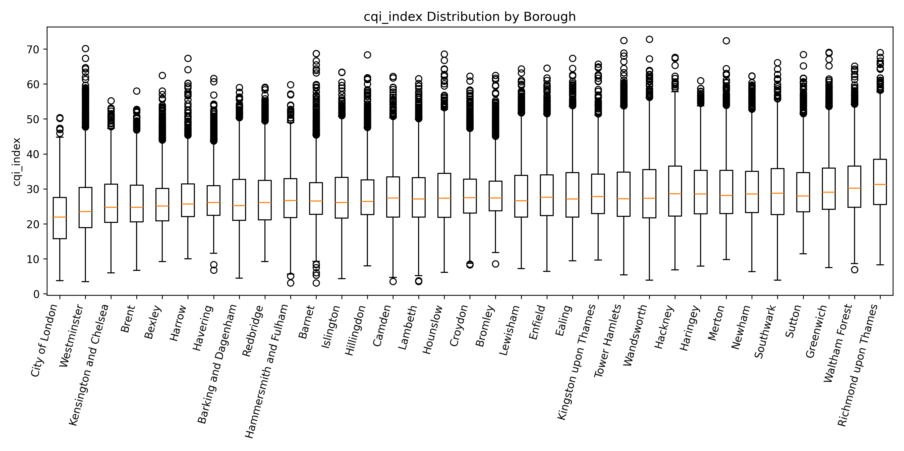
Figure 5.16: Distribution of CECI Scores within Each London Borough
To further examine intra-borough variation, Figure 5.16 presents the distribution of CECI scores for each borough. The results show that internal disparities are substantial across all boroughs. Even in the highest-ranked boroughs, such as Richmond upon Thames and Waltham Forest, large interquartile ranges and overlapping distributions suggest that high cycling quality is not uniform but concentrated in selected corridors, while many other links remain only mid-performing. Similarly, in lower-ranked boroughs like the City of London and Westminster, the distributions are not only shifted towards lower medians but also highly dispersed, with numerous extreme low-CECI links. This highlights that borough-level averages can obscure significant within-borough inequalities: cycling environments are highly fragmented, and the experience of riders depends heavily on the specific routes available rather than the overall borough ranking.
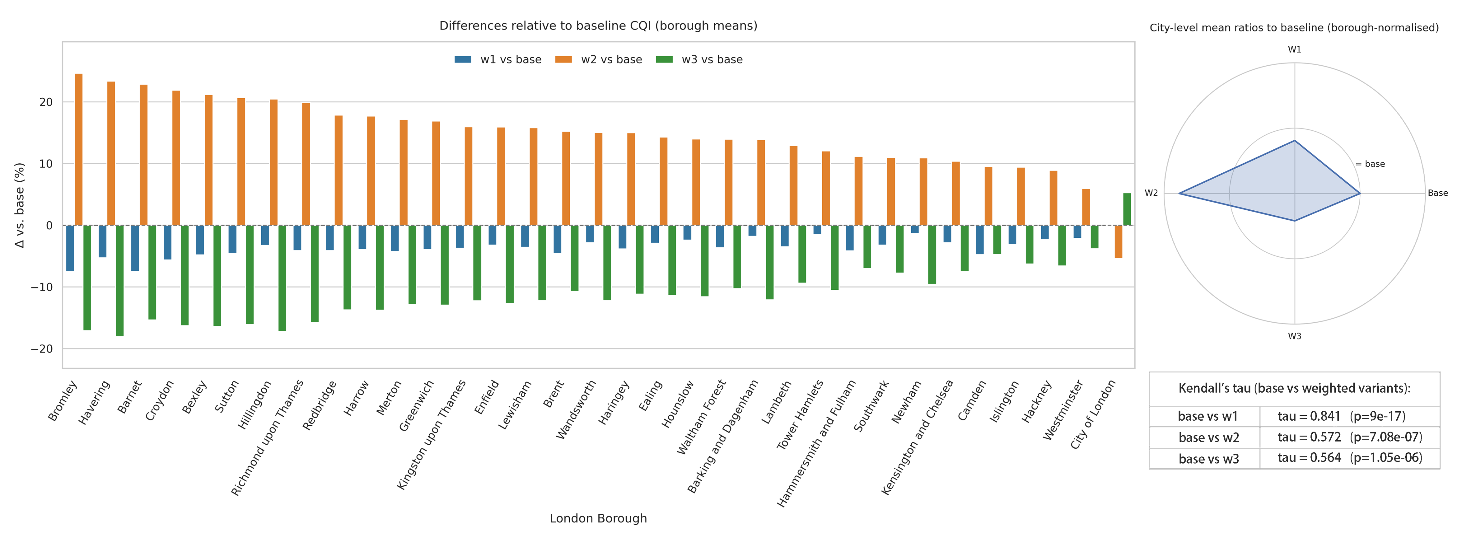
Figure 5.17: Sensitivity Analysis of Borough Rankings under Alternative Weighting Schemes
Sensitivity tests confirm that the equal-weight baseline is robust to moderate re-weighting. The alternative specification W1 shows negligible differences from the baseline (r=0.97, max |Δ|=7.5%), indicating that small perturbations do not materially affect borough-level results. By contrast, prioritising Perceptual Environment (W2) raises overall CECI levels by approximately 10–25%, whereas prioritising Network Centrality (W3) lowers levels by 8–18%. These shifts are consistent with city-wide sub-index distributions, where environmental quality achieves relatively higher scores while centrality underperforms on average. Rank correlations further show that borough ordering remains broadly stable under W1 (\(\tau = 0.84\)) but undergoes moderate reconfigurations under W2 and W3 (\(\tau = 0.57\)). The low correlation between W2 and W3 highlights complementary spatial logics rather than redundancy. Therefore, the equal-weight index is retained for headline analysis, while W2 and W3 provide policy-relevant bounds reflecting amenity-oriented versus connectivity-oriented priorities.
5.5 Validation
The study further compared CECI with observed cycling volumes from TfL’s 2024 spring count campaign. The raw dataset consisted of monitoring records collected at 15-minute intervals, covering three categories of cycling modes: conventional cycles, hire bikes, and private cycles. After cleaning, only these three modes were retained, and records were restricted to weekdays between 07:00 and 19:00. Counts were then aggregated into daily totals and averaged for each site. Monitoring stations were subsequently matched to the nearest road segment with a CECI value within 100 m.
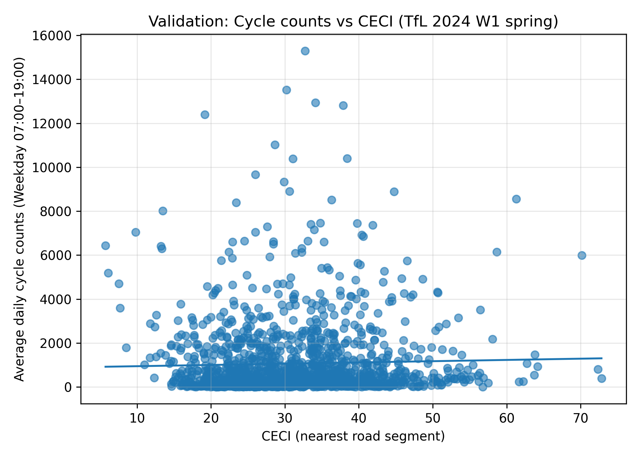
Figure 5.18: Validation: Cycle counts vs CECI (TfL 2024 W1 spring)
As shown in Figure 5.18, the results indicate a positive but weak association between CECI and observed cycling volumes: Pearson r = 0.03 (p = 0.22), Spearman ρ = 0.10 (p < 0.001). This suggests that, although explanatory power is limited, road segments with higher CECI scores generally correspond to slightly greater cycling flows, supporting the basic validity of the index in capturing spatial variation in cycling environment quality. The weak correlations likely reflect the restricted temporal coverage of the validation dataset and potential spatial mismatches between monitoring sites and road segments. Accordingly, CECI is more appropriately interpreted as a relative spatial diagnostic rather than a direct predictor of absolute cycling flows.